With my diversity of experience, I’m unlikely to be hired by anyone with the “I want a zombie who has done THIS JOB for at least 5 years already” mentality. So I have decided not to worry about autobot recruiters, beyond ensuring that I’m using the right keywords in both my resume and cover letter.
Optimizing for what I do excel at – flexible, accurate, brief and impactful information presentation – ought to win me a few points on the job market playing field.
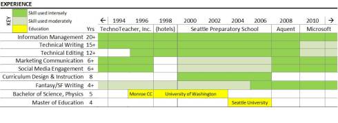
My new, improved resume starts with an info-graphic – in this case, a fancy chart.
 The on left hand side and across the top are the sweet spots found in eyeball-tracking usability studies. So that’s where the juiciest data lives: experience keywords, years of experience, and companies worked for.
I’ll admit – it took some effort to get right. The first iteration of the chart didn’t include a key. After some usability testing (“hey, tell me what you think this means?”) I found out that it needed both color and a key. Since I’ve added that, the response has been immediately positive.
Sure, it’s a risk to have a resume that steps outside the norm. But I’m already outside the norm – the greatest risk I can take is to not be me.
Disagree? Suggestions? I’m all ears.

I think it’s a very interesting approach. I’m always hearing that employers want to get a quick, easy idea about skills, and this seems to do it pretty well. I’m not sure what the (hotels) part means, but it looks good otherwise.
I think that’s a very clever way of putting across experience in a very understandable way.
The graphic shows that some thought, effort, and creativity were expended. I used to read lots of resumes, and after a while they became, well, mind-numbing because they were all the same. (Also, I developed an allergy to the typeface Garamond, but that’s a tale for another time.)
Yes, I would give a resume with a graphic like that some additional karma points were it to cross my desk.